

In Power BI, finding a hidden feature or shortcut can feel like stumbling upon a rare artifact in an RPG—unexpected, powerful, and immediately useful. For those of us immersed in data, Power BI is a bit of a playground. Sure, it’s a tool, but it’s also a powerful interface that helps transform data into stories, trends, and actionable insights.
Here are some Power BI treasures I’ve come across—tips, shortcuts, and hidden features that can enhance your workflow and maybe even surprise you.
1. Centralized Data Repositories & Certified Datasets – Creating Your Base Camp
When you’re working with a lot of data, keeping datasets consistent and certified is the backbone of smooth reporting. For many, that means a central repository for certified datasets (with strict rules: measures are added only at the dataset level, never directly in reports). Think of it as a “base camp” in Power BI—data comes from a trusted source, so every report is grounded in consistent, accurate information.
Pairing this with a check-in/check-out process via SharePoint for all datasets keeps versions controlled and everyone on the same page. Like updating a character’s inventory, this makes sure everyone’s working from the same set of “gear.”
2. Theme JSON Files – Style Once, Use Everywhere
One of the trickiest parts of managing multiple reports is keeping the design consistent. Use JSON themes. When we use a common theme across reports, setting properties in the theme editor and importing the JSON file updates them all at once. This saves endless hours manually adjusting each report. It’s like having a template for a character’s look and feel, making sure everything is visually consistent, from one report to the next.
How to use report themes in Power BI
3. Deployment Pipeline and ALM Toolkit – Power Moves for Dataset Management
If your datasets are large and constantly evolving, you’ll understand why ALM Toolkit is invaluable. We use it to sync big datasets between QA and Production, sometimes directly updating the PRD with partial changes. ALM Toolkit handles the heavy lifting, making it possible to only push what’s new without touching the whole structure. Combine this with Power BI’s deployment pipeline, and you’ve got a powerful, automated setup that’s surprisingly efficient.
Best Practice Analyzer (BPA) within Tabular Editor—a quick way to keep datasets optimized as they grow. Think of it like a regular tune-up for a high-performance car: the better maintained, the better the output.
Get started with deployment pipelines
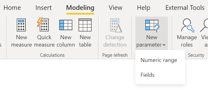
4. Using Field Parameters – Dynamic Interactivity with Minimal Effort
Field parameters are a game-changer for user experience, allowing report viewers to switch between views based on what they’re interested in—whether that’s currency, specific periods, or custom hierarchy views. This flexibility without complexity? It’s like handing players the power to switch classes in a game, letting them explore data the way they want without adding an extra layer of complexity for the developer.
5. Power Automate and Power Apps Integration – Extending the Power BI Universe
Need a quick way to act on data insights? Integrate Power Automate and Power Apps within Power BI. We’re using Power Automate to pull Snowflake data daily and send consolidated reports each morning, keeping stakeholders up-to-date. Meanwhile, Power Apps enables editing directly within Power BI—like letting users update quotas in real-time. It’s all about turning insights into actions, and Power Automate and Power Apps bring that interactivity right into the report.
6. Using API for Metadata Tracking – Meta-Monitoring Your Reports
For those of us who like metrics on our metrics, using Power BI’s API to capture metadata and usage information is one of those “behind-the-scenes” gems. We track metadata usage patterns, see which visuals get the most attention, and know exactly how people interact with our dashboards. And, of course, this is all reportable on another Power BI dashboard!
7. Custom Visuals with Charticulator – Breaking Out of Standard Templates
While Power BI’s default visuals are robust, sometimes you need a unique view. Charticulator allows for custom visual creation, letting us build designs that go beyond standard options. It’s ideal for situations where the default visuals fall short, and you want a tailored approach to data storytelling. Think of it as custom skin design in a game—why settle for default looks when you can create something entirely your own?
Get Started with Charticulator

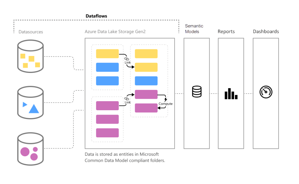
8. Data Flows and Master Data Management – Setting Up for Scale
In Power BI, data flows act as a preparatory layer, allowing us to clean and transform data before it hits the dataset. By using data flows for Master Data and Fact tables, we simplify the main dataset’s structure, consuming from data flows rather than source tables. This structure improves performance and keeps the backend organized. For complex environments, this setup is like your organized loot chest—it keeps things tidy and ready for action.
Introduction to dataflows and self-service data prep

Leave a reply to mindfully487ffd563d Cancel reply